Understanding Trading Candlestick Charts
Candlestick charts serve as an aid for traders to assess price fluctuations and forecast upcoming trends in stocks and other financial markets like cryptocurrencies and forex trading assets.
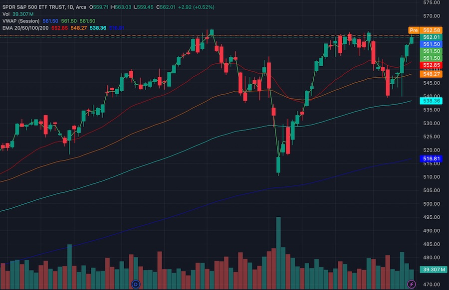
They offer insights into market emotions and assist traders in making well informed decisions. In addition to candlestick patterns, traders frequently rely on associated indicators, like VWAP (Volume Weighted Average Price), EMA lines (Exponential Moving Average) and volume bar charts. This piece will delve into the workings of candlestick charts while exploring patterns and complementary trading measures.
What Are Candlestick Charts?

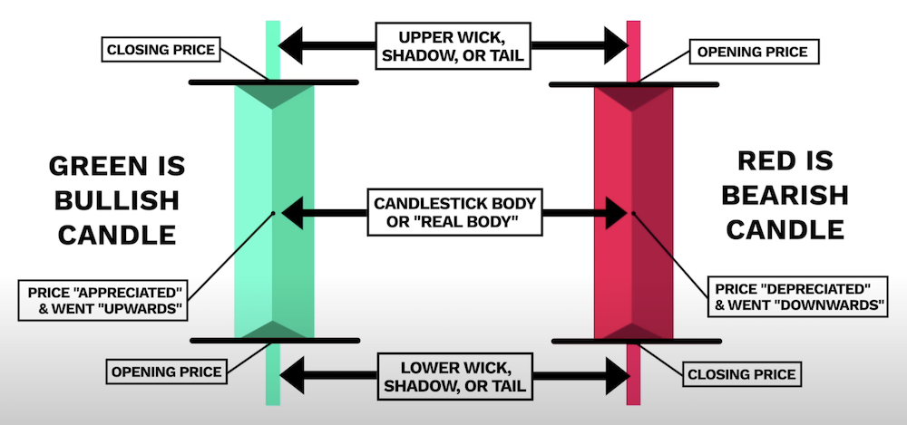
Candlestick charts visually represent asset price movements over a specified time period. Each "candlestick" consists of four key data points:
-
Open: The price at which the asset started trading during the time period.
-
Close: The price at which the asset finished trading for that time period.
-
High: The highest price reached during the time period.
-
Low: The lowest price reached during the time period.
Visually, these data points are referenced as follows:
-
Body: the middle block represents the open and close prices along with direction. If the block is solid or red or black, this indicates the close price was lower than the open price (a bearish signal). If the block is hollow or green or white, this indicates the close price was higher than the open price (a bullish signal).
-
Wicks or Shadows: the thin lines above and below the body represent the high and low prices.
As an alternative to candlestick charts, traders also use HLOC (or OHLC) charts which use the same four data points, ie. HLOC being an abbreviation of High, Low, Open and Close, with the main difference being the HLOC chart layout displays the information as a single line with no body.
Common Candlestick Patterns
Traders often look for specific candlestick patterns to help predict future price movements. The following are some of the most commonly used patterns
-
Doji: represented by a small body with long wicks and occurs when the open and close prices are very close to each other. This indicates market indecision. If a doji occurs after a long uptrend or downtrend, it could signal a price reversal.
-
Hammer: represented by a small body near the top with a long wick below. This indicates the price dropped significantly during the time period before buyers pushed the price up. If a hammer occurs at the bottom of a downtrend, it could signal a bullish price reversal.
-
Shooting Star: represented by a small body near the bottom with a long wick above (ie. opposite of a hammer). This indicates the price increased significantly during the time period before sellers pushed the price down. If a shooting star occurs at the top of an uptrend, it could signal a bearish price reversal.
-
Engulfing Patterns: represented by a small candle followed by a larger one in the opposite direction (ie. the 2nd one engulfs the first). A small bear candle (red) followed by a larger bull candle (green) is called a bullish engulfing pattern, which indicates an uptrend. The opposite (ie. small bull followed by larger bear) indicates a downtrend.
-
Morning Star: represented by three candles; a large bearish candle, a small doji, and a large bullish candle indicates a bullish price reversal.
-
Evening Star: represented by three candles; a large bullish candle, a small doji, and a large bearish candle indicates a bearish price reversal (ie. opposite of evening star).
Key Trading Metrics
Frequently used in conjunction with candlestick charts, traders analyse related trading metrics to provide additional insight into potential price movements. The following are some of the more common ones:
SMA (Simple Moving Average)
The SMA, represented by a line, indicates the average price. In terms of a candlestick chart, the SMA provides a more simplistic view of the moving average, so would only be used as an simple alternative to the candlestick chart.
VWAP (Volume Weighted Average Price)
The VWAP, represented by a line, indicates the average price weighted by volume. The line can therefore show periods with higher trading volumes, providing more insight into the asset's true value.
When the price is above the VWAP line this indicates a bullish (upward) trend, whereas, the when the price is below the VWAP line this indicates a bearish (downward) trend. Traders use the VWAP as a dynamic support (or resistance level) indicator and will often consider a move above or below the VWAP line as a signal to buy or sell the asset.
EMA (Exponential Moving Average)
The EMA, represented by a line, indicates the average price weighted by recent price data. The line is more responsive to price movements compared to the SMA line. Traders often use multiple EMA Lines (eg. 9 day, 21 day or 50 day) to determine the trend over different time periods.
A crossover between short term and long term EMA lines (eg. EMA-9 vs EMA-21) can signal a buy or sell. A short term EMA crossing above a long term EMA, called a "Golden Cross", signals a potential upward trend. Whereas a short term EMA crossing below a long term EMA, called a "Death Cross", signals a potential downward trend.
Volume Bar Charts
Volume bar charts show the total amount (volume) of trades over the time period. The chart is often displayed at the bottom of a candlestick chart. Used in conjunction with the candlestick prices, traders can view the volume chart to help gauge the strength of each price movement.
High volume during an upward trend indicates strong buying interest and a more sustainable uptrend. Whereas, low volume during and upward trend indicates the uptrend may not be sustainable.
Volume spikes, indicated by sudden large increases in volume, often accompany significant price movements and can signal potential reversals or breakouts.
If the price is rising matched with volumes declining, this can indicate a weakening trend, called a divergance.
Summary
To excel in trading successfully requires a grasp of reading candlestick charts and decoding patterns found within them. Pairing up the examination of candlesticks with metrics like VWAP and EMA lines alongside volume bar charts gives traders a perspective of the market. These instruments aid traders, not only in spotting trends but, in gauging the intensity of price shifts and facilitating informed trading choices.
Whether you are into day trading or investing in stocks or cryptocurrencies, mastering the technical aspects can enhance your trading approach to help maximize results in the market.
